Creative Ways to Visualize Your Budget on an Infographic Template
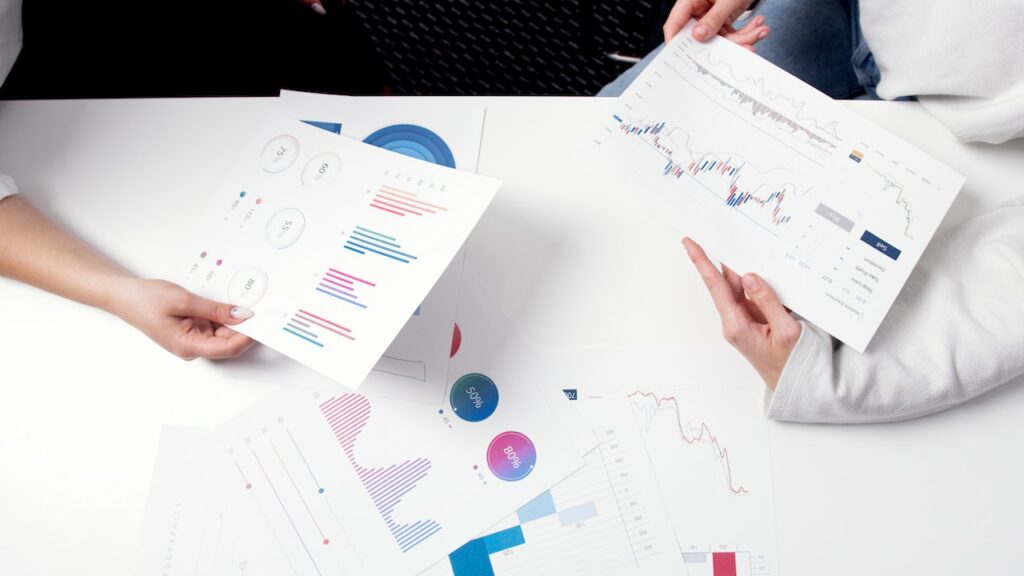
While a budget spreadsheet is great for keeping track of your finances, it can be hard to make sense of all the data. An infographic template is a useful tool to help you visualize your budget and gain an understanding of where your money goes each month. With the right design, you can present the information in a way that’s easy to understand and helps you stay on top of your financial goals.
The Benefits of Using an Infographic Template for Budget Planning:
Using an infographic template for budget planning allows you to quickly identify potential areas where expenses can be reduced or investments made. It also helps you better understand how expenses are related and gives you more insight into where additional savings could be made. Additionally, it makes the budget planning process much easier and faster, so you can spend more time working on other tasks.
Here are 12 creative ways to visualize your budget using an infographic template:
1. Create a “Pie Chart of Spending” –
Breaking down expenses into categories (food, utilities, housing, etc.) and displaying them as percentages in a pie chart is one of the best ways to quickly identify and compare spending habits.
2. Use Color Coding –
To make the information easier to read, consider assigning different colors to different categories or income sources. This will provide instant visual cues that help you gain clarity on exactly where your money is going each month.
3. Map Your Expenses –
You can also create a map that shows how different expenses correlate to one another. For example, if you have a housing expense and an entertainment expense, mapping them out can help you understand the nature of each spending.
4. Create Category Graphics –
If there are multiple categories in your budget, such as food, utilities, etc., you can create visuals (such as bars or circles) for each category that illustrate their relative weight in the overall budget.
5. Use Graphs to Show Progress over Time –
An infographic template is ideal for showing progress over time with graphs that display income and expenses month-by-month or year-by-year. This will give you an easy way to track changes and ensure that your financial goals are being met.
6. Show Your Income Sources –
If you’re receiving income from multiple sources, such as a job, side hustles, investments, etc., you can use an infographic template to show how much each source contributes to your overall income. This will also make it easier for you to identify areas where additional income could be generate.
7. Track Expense Trends –
Trends in spending should be monitor so you know where it’s going and why. Using an infographic template, you can create graphics that illustrate spending trends over time and compare them with other expenses or investments that have been during the same period.
8. Use Icons –
Using icons is an effective way to represent different categories in your budget. For example, an icon of a fast food meal could represent the food category, or a car for transportation expenses.
9. Show Your Savings Goals –
An infographic template is also great for tracking your savings goals by showing both the amount you’re aiming for and how much you’ve saved so far. This will help motivate you to keep striving towards achieving those goals.
10. Utilize Charts & Graphs –
Charts and graphs are helpful visual aids that can quickly show patterns and trends in your spending habits over time. They can be used to compare different income sources, track specific purchases, or illustrate total annual expenditure versus total annual income.
11. Compare Budgets –
You can also use an infographic template to compare different budgets and identify areas where you could be saving money or investing more wisely. This will help you make informed decisions that are aligned with your overall financial goals.
12. Integrate Data Points –
Including data points in an infographic is a great way to show how various elements affects the budget as a whole, such as average rent prices in your area or average grocery costs for a family of four.
Conclusion:
An infographic template is a great tool for visualizing your finances, tracking spending trends, and understanding where you can cut costs or invest more wisely. By breaking down expenses into categories, using color coding, and incorporating elements like icons, charts and graphs, you can make financial decisions that align with your goals.